Retrograde
Astrology rendered as time-based graphs, grounded in real ephemeris measurement.
Overview
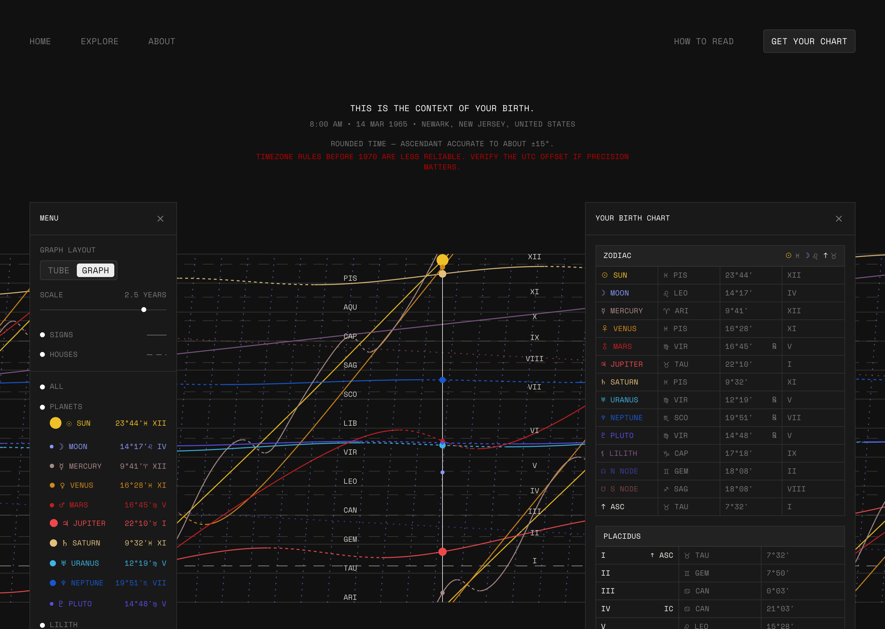
Project Retrograde is a web app that uses ephemeris data to create graphs of planetary positions over time to provide users with a novel, time-based birth chart.
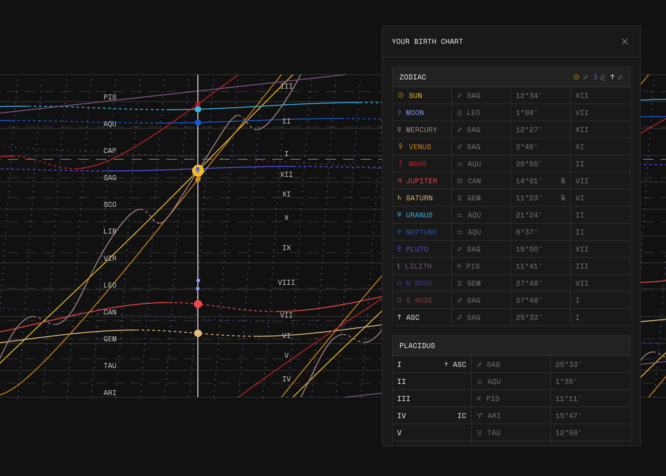
A regular birth chart is a snapshot of where the planets were at the moment a person was born. Retrograde plots each planet's position as a line over time, with the birth as a vertical line across it, so users can see where each planet was coming from and where it went next. Users can enter their own birth details, explore the sky at any date, and learn how to read a chart one layer at a time.
I designed it in Figma and built it with Claude Code and Cursor. Stack: Astro, TypeScript, Canvas 2D.
The Problem
How might we bridge the gap between astrology and astronomy, so people can see the real data behind their birth chart?
Astrology and astronomy describe the same sky, but the tools keep them apart. Every astrology app shows a wheel: a snapshot of where each planet was at one instant, sorted into signs and houses. That hides three things. Time, since users can't see that Mercury was in the middle of a retrograde, only that it's flagged. Continuity, since a planet a few arcminutes away from the next sign just reads as 'in Leo'. And provenance, since the positions come from the same data observatories use, but nothing lets users trace a symbol back to the number behind it. I wanted to give people the actual data so they can understand how their chart is read and interpret it on their own.
Design Decisions
These are the decisions that shaped the product but aren't visible on the live site. Each one was debated, written down with the alternatives, and locked in.
One rule sets the scale: one day per one degree.
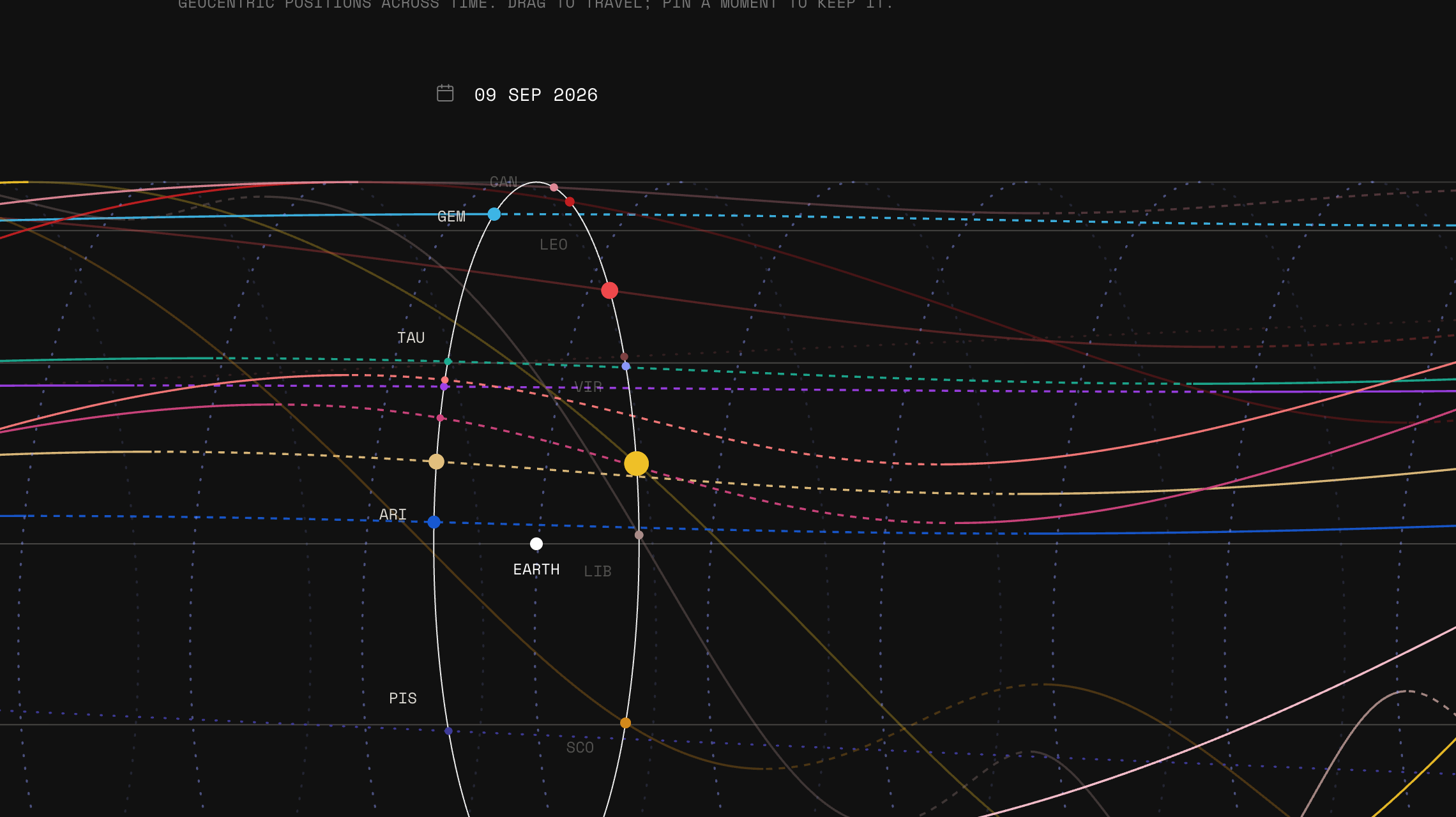
The visualisation has a single fixed number: one day of time for every degree of longitude. Everything else follows from the shape of the frame. The Sun moves about 1° a day, so it always draws a 45° line, which acts as a built-in ruler. Steeper lines are faster planets, flatter lines are slower ones, and a line sloping down means retrograde. A taller frame shows fewer days, so zooming happens on its own and mobile didn't need separate work.
Retrograde is calculated, not labeled.
Instead of tagging a planet as retrograde, the app calculates the direction of its motion as seen from Earth. Positive means direct, negative means retrograde, and zero is the turning point (the station). The dashed part of each line starts and ends exactly where that value crosses zero. This runs on daily data before anything is simplified for display, because a 3-week Mercury retrograde can disappear if the data is sampled too coarsely.
The tube, the graph, and the wheel are the same object.
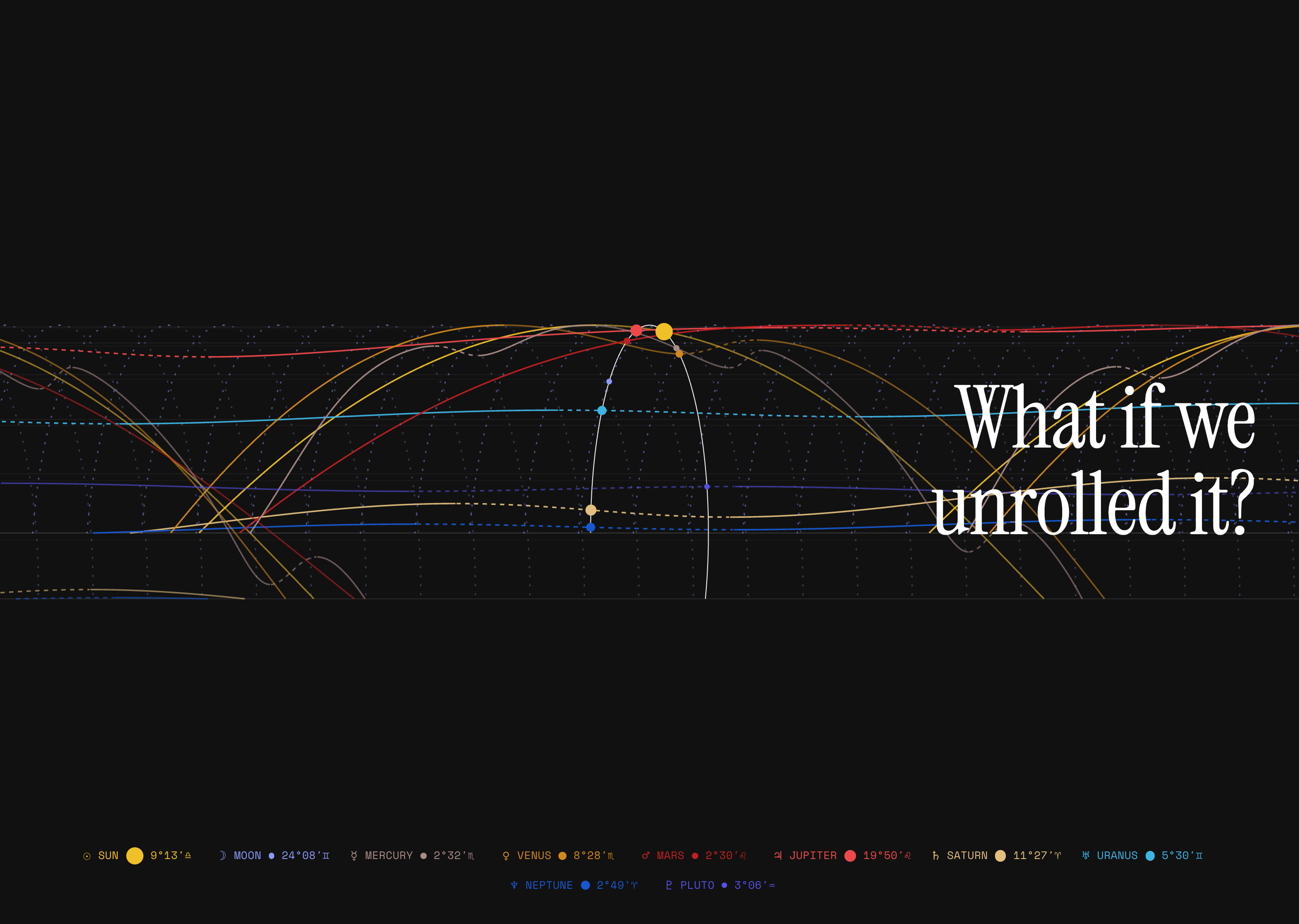
Rolling the graph around its time axis so 0° and 360° meet produces a cylinder with the zodiac wrapped around it and Earth in the centre. Looking down the axis shows the familiar chart wheel. Unrolling it gives the graph. The transition on the homepage is a roll plus a camera move, not a crossfade, so the geometry stays intact the whole way through.
House lines stay fixed at the moment of birth.
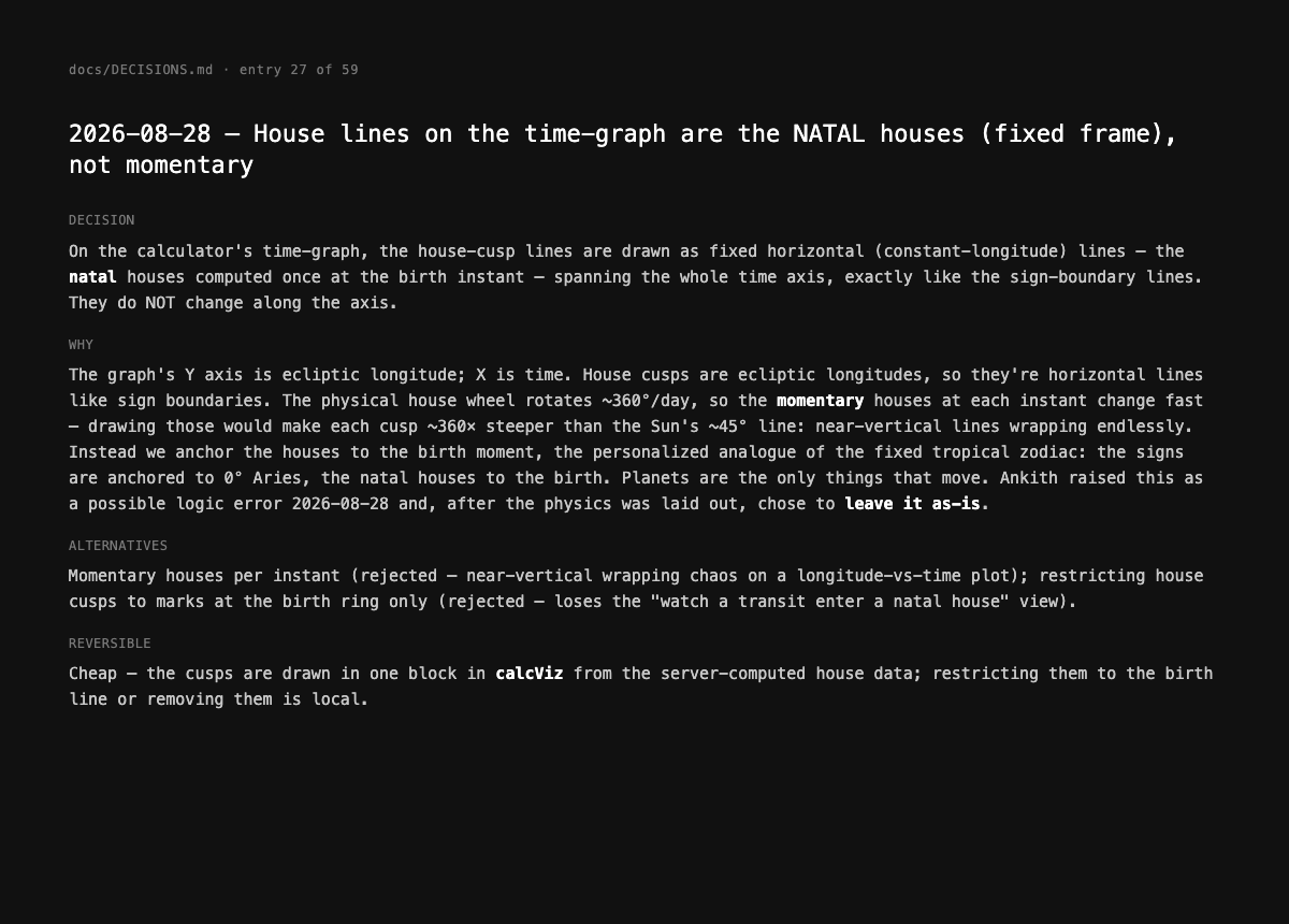
Houses rotate a full circle every day, so drawing them at every moment would produce near-vertical lines wrapping endlessly across the graph. Instead, the house lines are frozen at the birth instant and drawn flat, the same way signs are anchored to 0° Aries. The planets are the only things that move. I initially flagged this as a possible logic error, but after working through the physics, I kept it.
Everything is measured from Earth.
Retrograde only exists from Earth's point of view. Nothing actually orbits the Sun backwards, so a heliocentric view would remove the one thing the graph is meant to show. The whole product is geocentric on purpose, using the same positions every published chart uses.
Features
The app tells users when it's unsure.
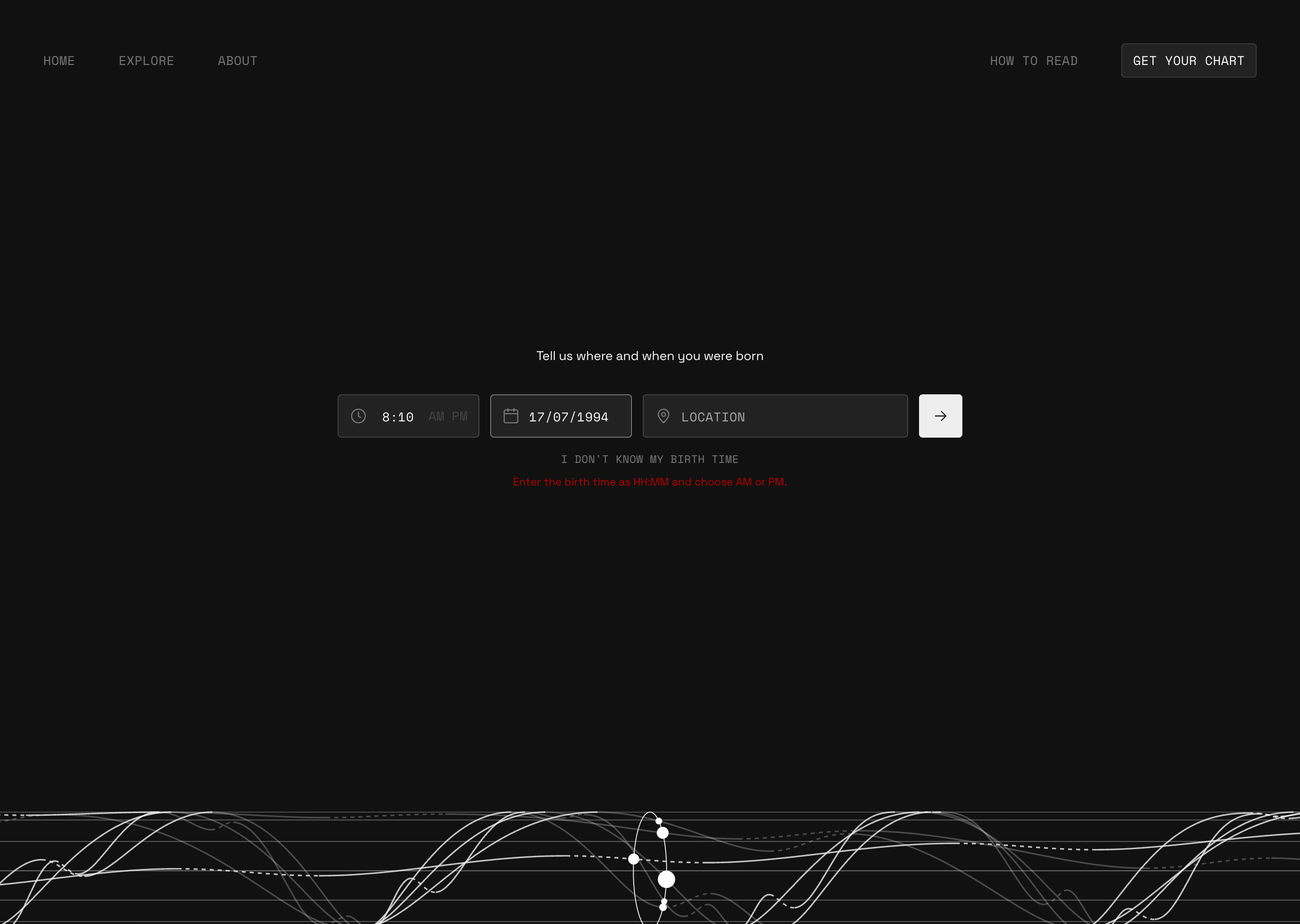
The most common mistake in birth chart entry is mixing up AM and PM, which moves the Ascendant by about 180°. So the AM/PM toggle has no default, and the form won't submit until one is chosen. If the birth time is on the hour or half hour, the chart flags that it may be rounded and shows how far off the Ascendant could be. Births before 1970 get a warning that timezone records are less reliable, and a time that never existed because of a daylight saving change says so.
When something can't be calculated, the app locks that cell with a note instead of leaving it blank or making up a value. If a user doesn't know their birth time, the houses are locked. Above 66° latitude, where the standard house system doesn't work, it switches to Whole Sign houses and says so. Even the download button says 'coming soon' in its own label.
Process
I designed it in Figma and directed two AI agents to build it.
Before writing any code, I designed every screen in Figma and wrote out the product thesis and the physics spec. Claude Code handled the architecture, the maths behind the visualisation, and new pages. Cursor handled copy and small edits. Both worked from three documents in the repo: a set of non-negotiable rules, a 560-line spec, and a decision log with 59 dated entries, each recording what was decided, what was rejected, and why.
The design decisions were mine. The agents were there to execute them quickly and to be held to the documents. In total: 7 working days, 169 commits, and 74 tests. Every colour, spacing, and type value on screen comes from a Figma token. If one was missing, the rule was to add it in Figma and regenerate, never to hard-code it.
The log also caught the agents when they went wrong. The project started as Astro with React, but by launch nothing on the site actually used React, and a 191 KB runtime was still being shipped. A caching setting never took effect because of the order it was generated in. Both were found by measuring, fixed, and recorded as amendments instead of being quietly rewritten.
Outcome and Next Steps
The site is live, and there's more to build.
Next up is a birth-time uncertainty slider. Being 30 minutes off barely moves the Moon but shifts the Ascendant by a quarter of a sign, and showing which parts of a chart are reliable and which aren't is something no other tool does. The downloadable report is not built yet, and the muted text colour sits just under the AA contrast ratio, which I've queued as a token pass of its own.
Everything else is live. Open the site, scroll the tube into a graph, and put a birth on the timeline.


